(MaxMaher)

2023

Role

Art Director &
Visual Designer

In a nutshell

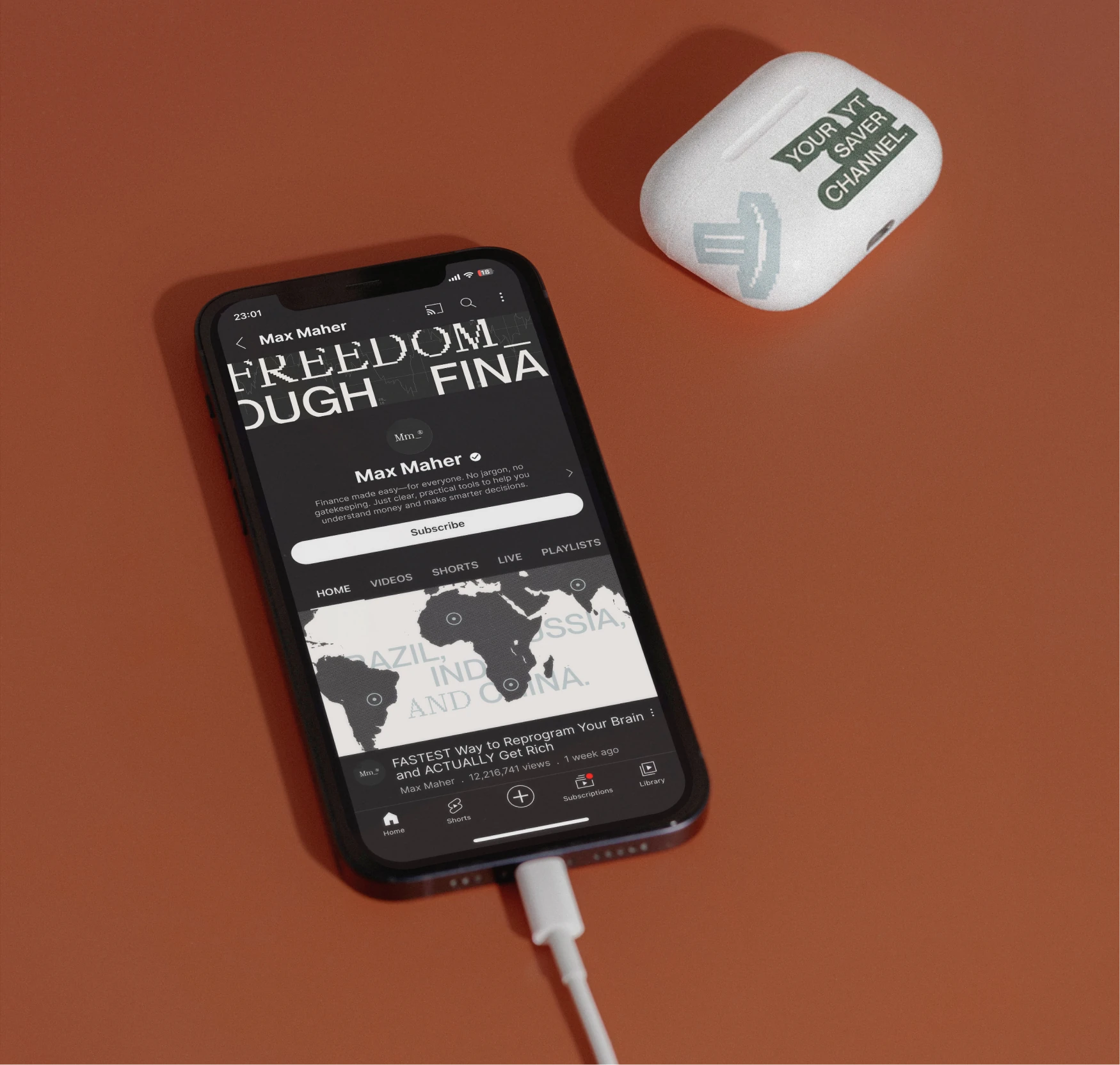
Max Maher is a digital entrepreneur with over 1.1K views on YouTube, who uses his channel to document his business and ideas. He sought assistance in developing a cohesive and dynamic rebrand for his communication platforms, where he presents economics in an engaging and intuitive way.

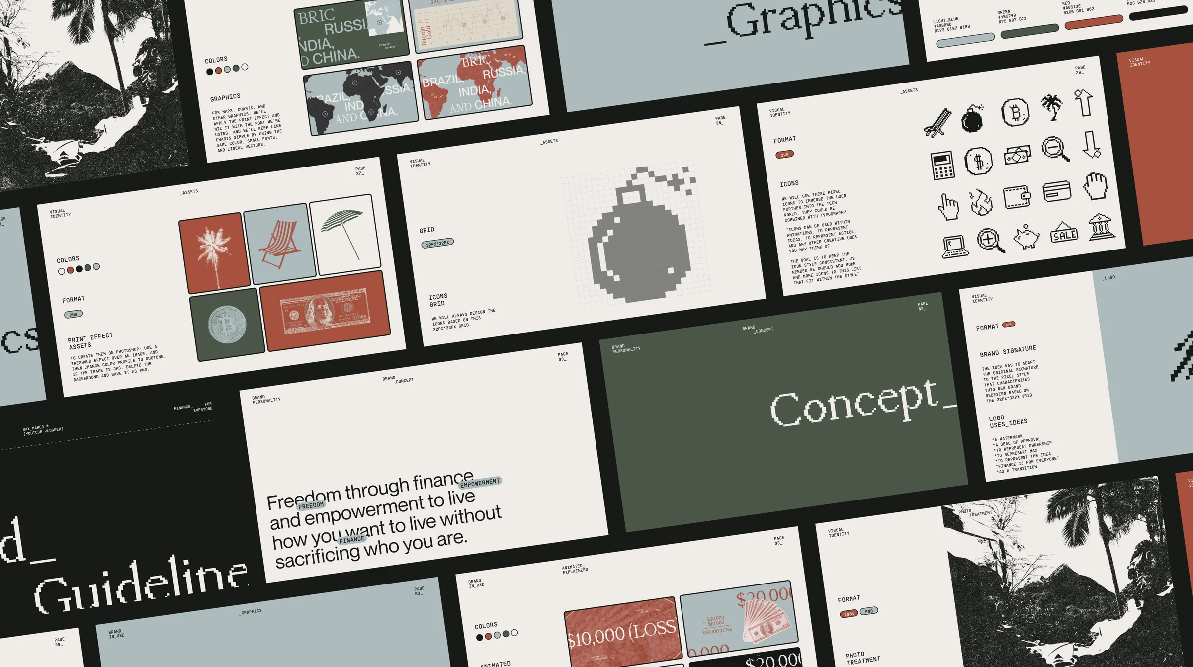
Max Maher brand guideline overview.
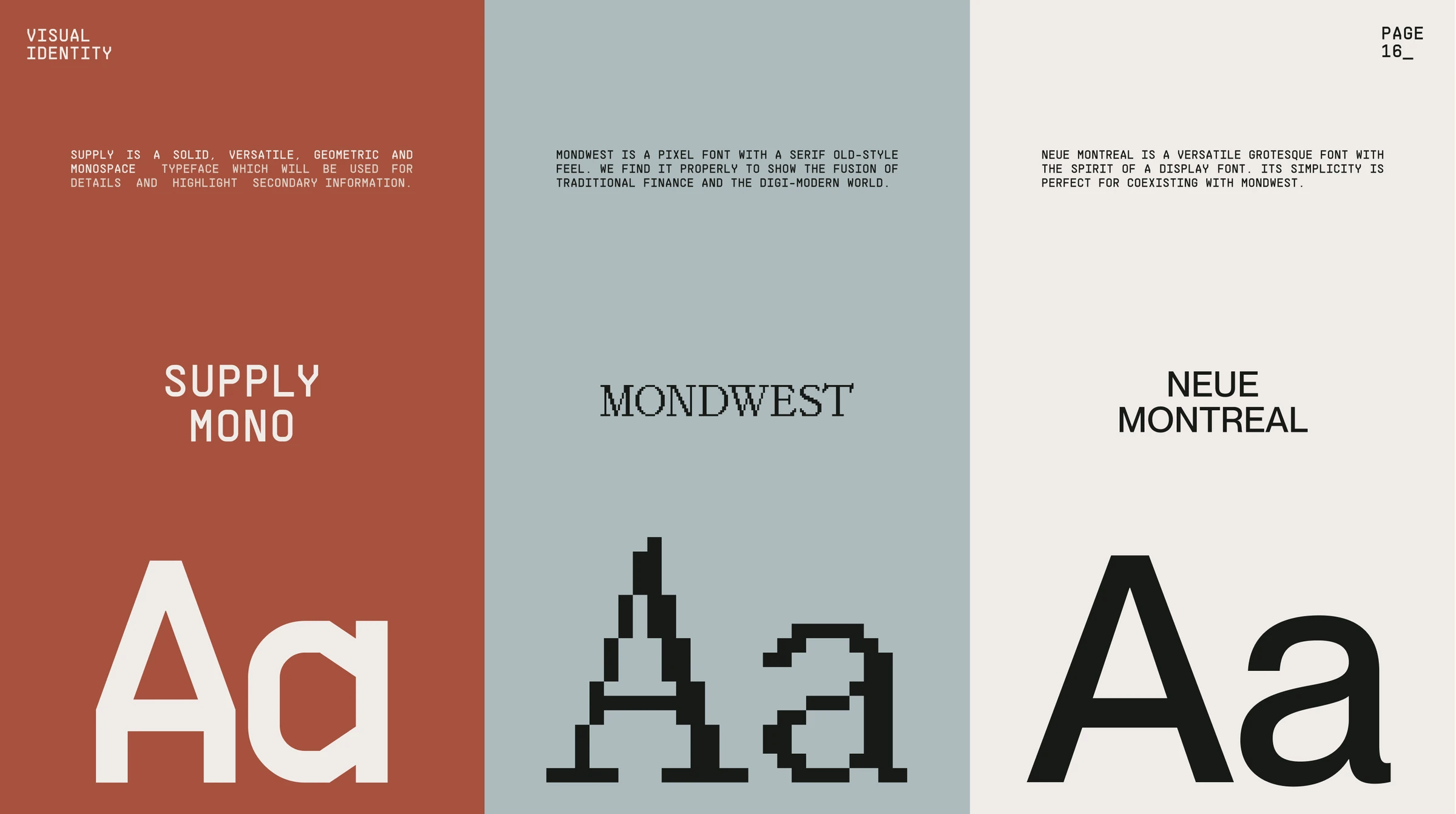
Max Maher typography system featuring Supply Mono, Mondwest and Neue Montreal.

(synopsis)

I led the art direction and digital design for Max Maher’s rebrand, working with Visual Designer Julia Franceschini to turn his personal context and subject matter into a flexible visual system. The project needed to reconcile two very different worlds: the optimism and sensory character of life in Puerto Rico, and the precision associated with economics, business, and technology.

Rather than adopting the predictable codes of financial media, we developed a warmer and more expressive identity. Vibrant Caribbean colors brought energy and approachability, while structured typography, digital references, and bitmap-based details grounded the system in Max’s analytical and technological universe.
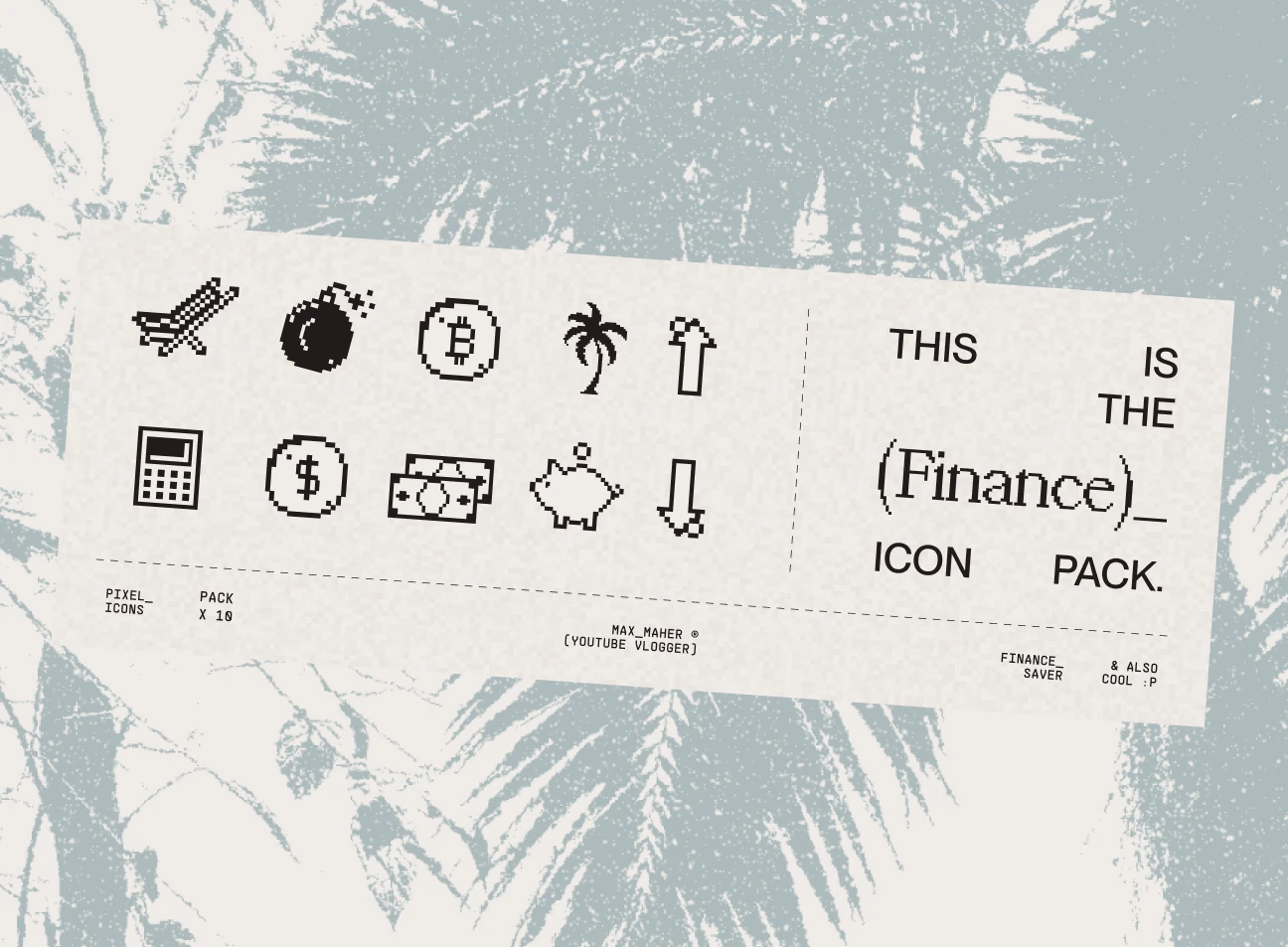
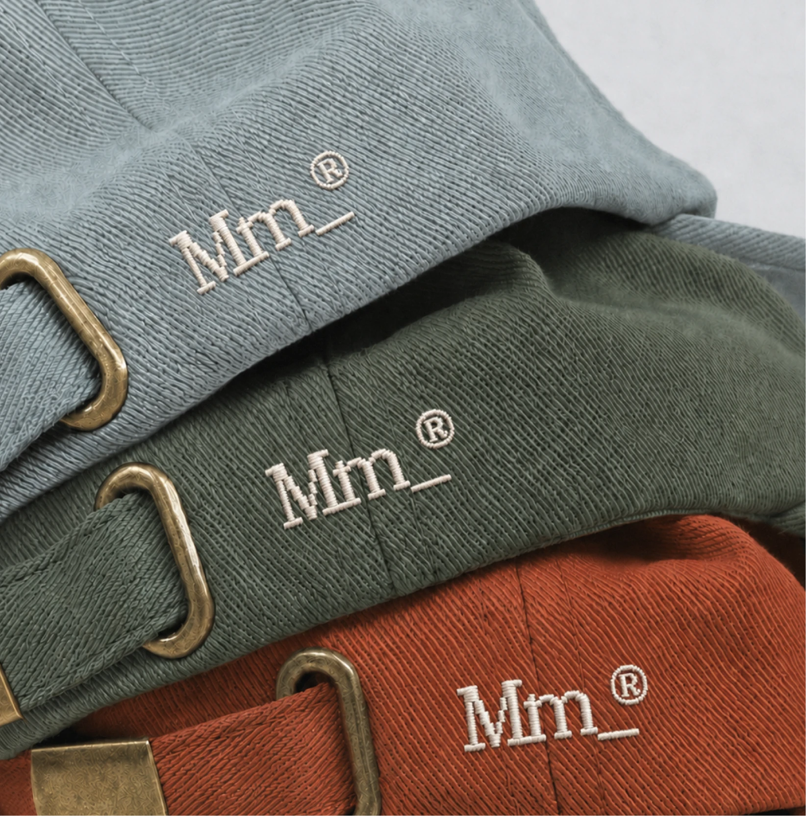
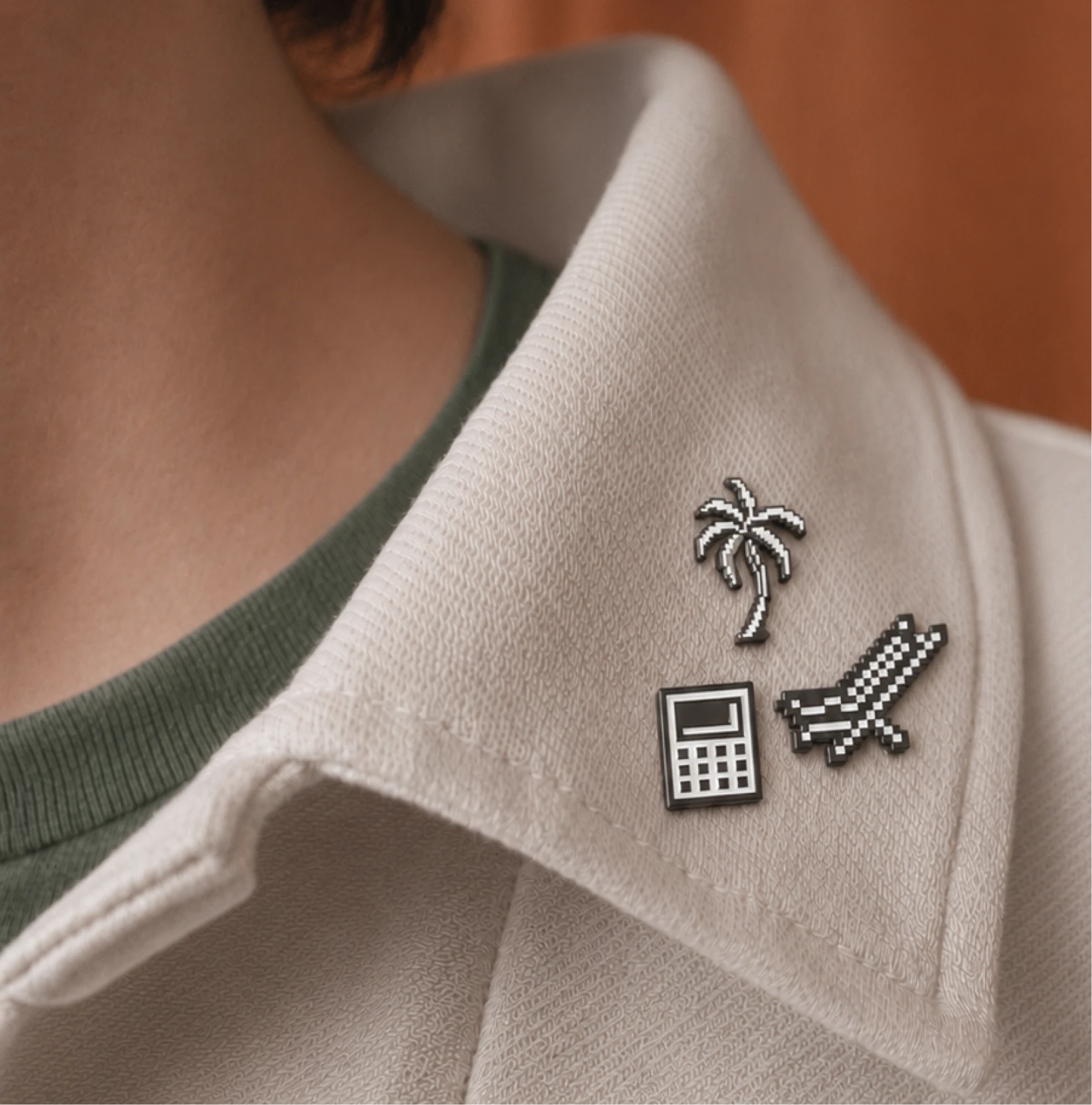
Pixel icon pack for Max Maher.

(the challenge)

The brand needed to work at the speed of an active content platform. It had to remain recognizable across video, social media, thumbnails, editorial graphics, and future commercial applications, while giving Max’s internal team clear rules they could use independently. The challenge was therefore not only to define a look, but to create a repeatable production language.

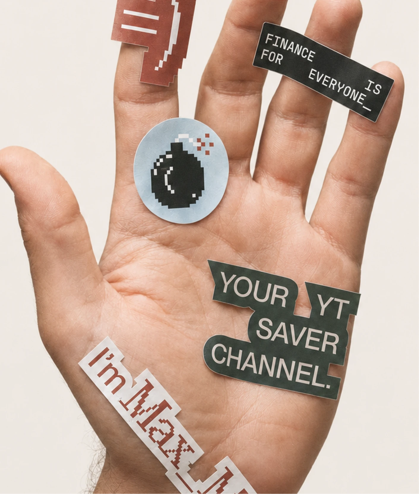
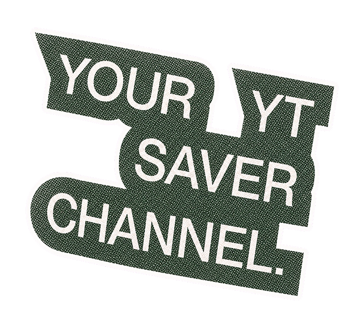
Max Maher campaign graphics held in a hand.
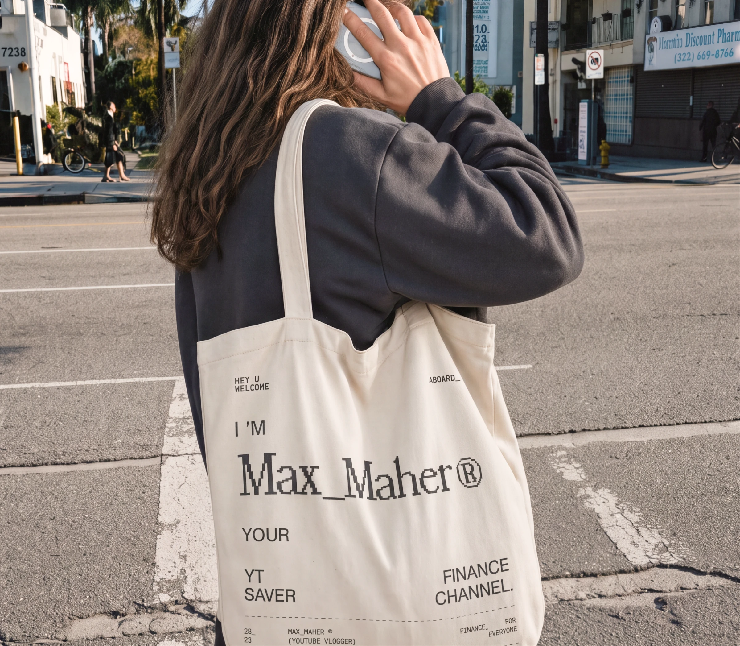
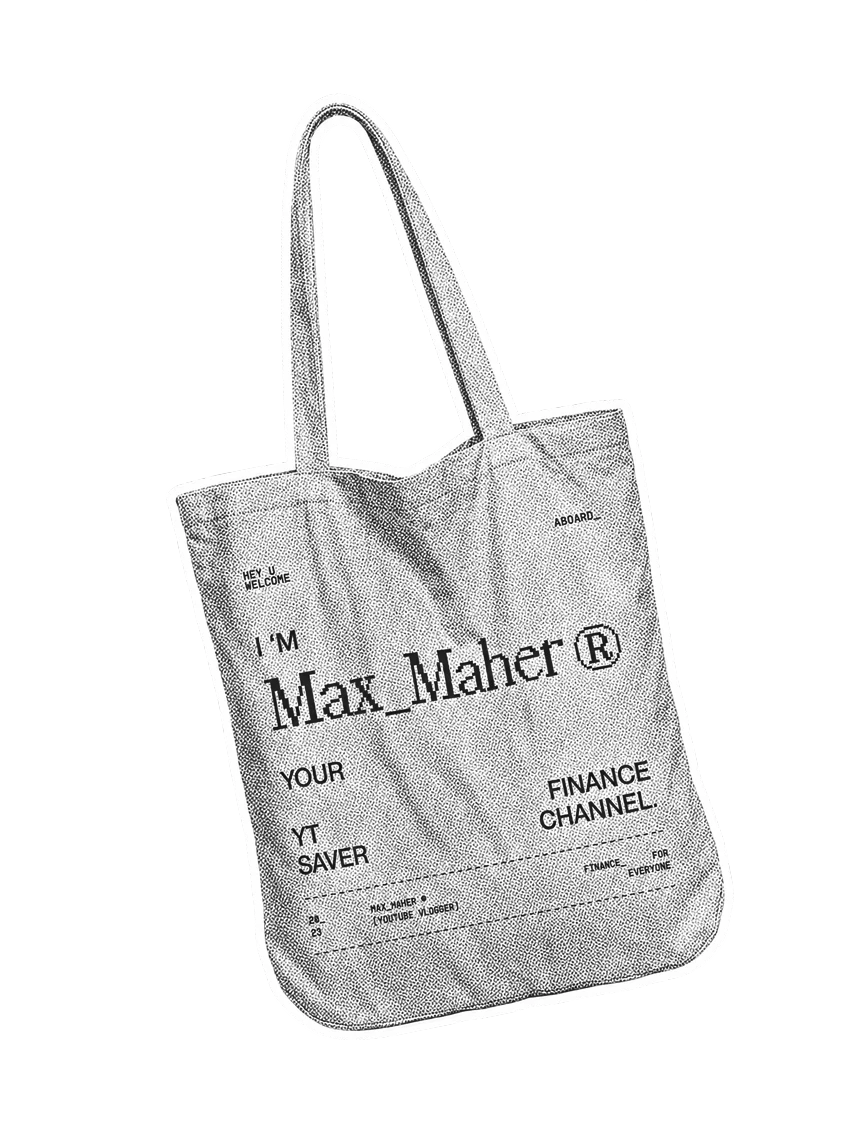
Max Maher branded tote bag photographed in the street.

(visual direction)

The selected direction combines tropical warmth with a distinctly digital structure. A vivid Caribbean palette differentiates the brand from the conservative blues, greens, and dark interfaces common in financial communication. Consistent image treatments create continuity across varied source material, while custom iconography translates recurring economic and technology concepts into a more immediate visual vocabulary.

A grotesque sans serif provides clarity and efficiency across digital formats. In contrast, bitmap typography acts as a sharper secondary voice: a reference to screens, data, and early digital culture that gives the identity a more memorable technological edge. The tension between both typefaces reflects the larger concept—human energy organized through systems and information.

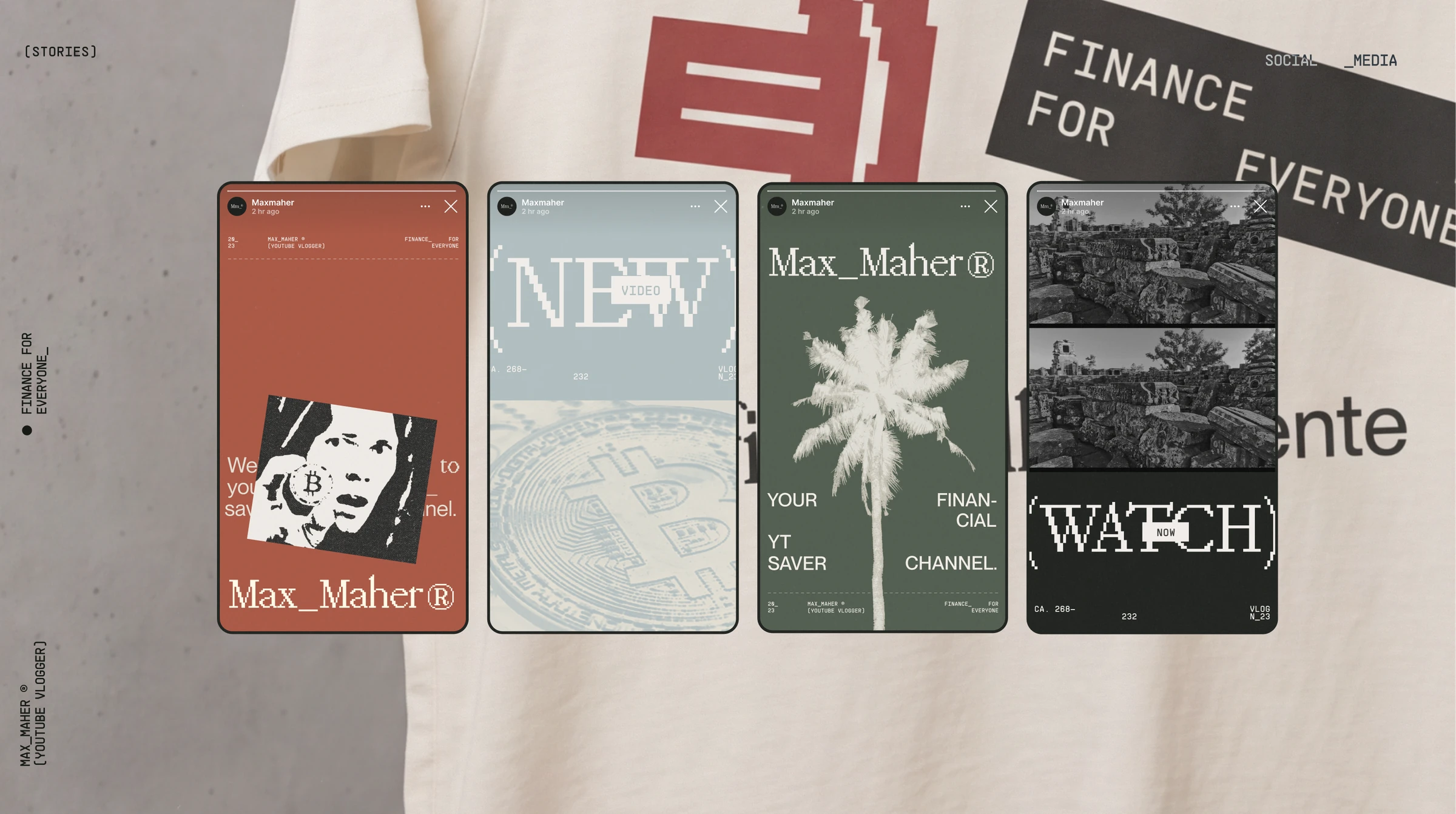
A set of Max Maher social story templates.
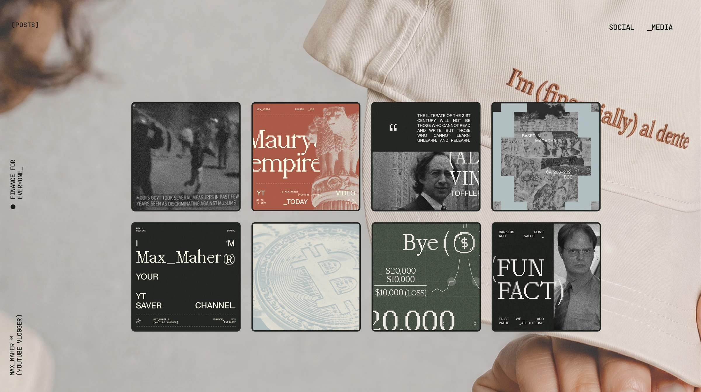
A collection of Max Maher social posts.

(digital experience)

Because the identity lived primarily through content, motion was treated as part of the system rather than a final embellishment. I developed storyboards and guiding animations to establish how compositions, icons, images, and information should behave over time. These principles created a more consistent rhythm across future videos and communication pieces.

The project concluded with a comprehensive brand manual documenting image treatments step by step, along with the use of typography, color, iconography, and motion.

The guide transformed the art direction into a practical toolkit that Max’s design team could apply and extend without losing consistency.

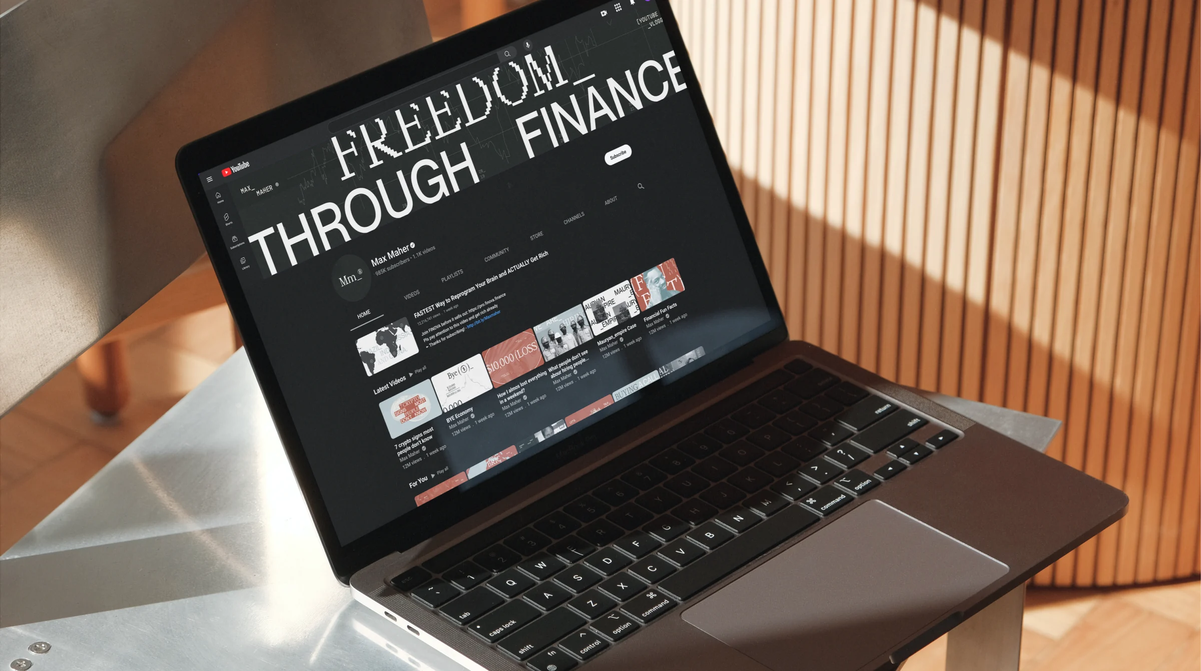
Max Maher website displayed on a laptop.
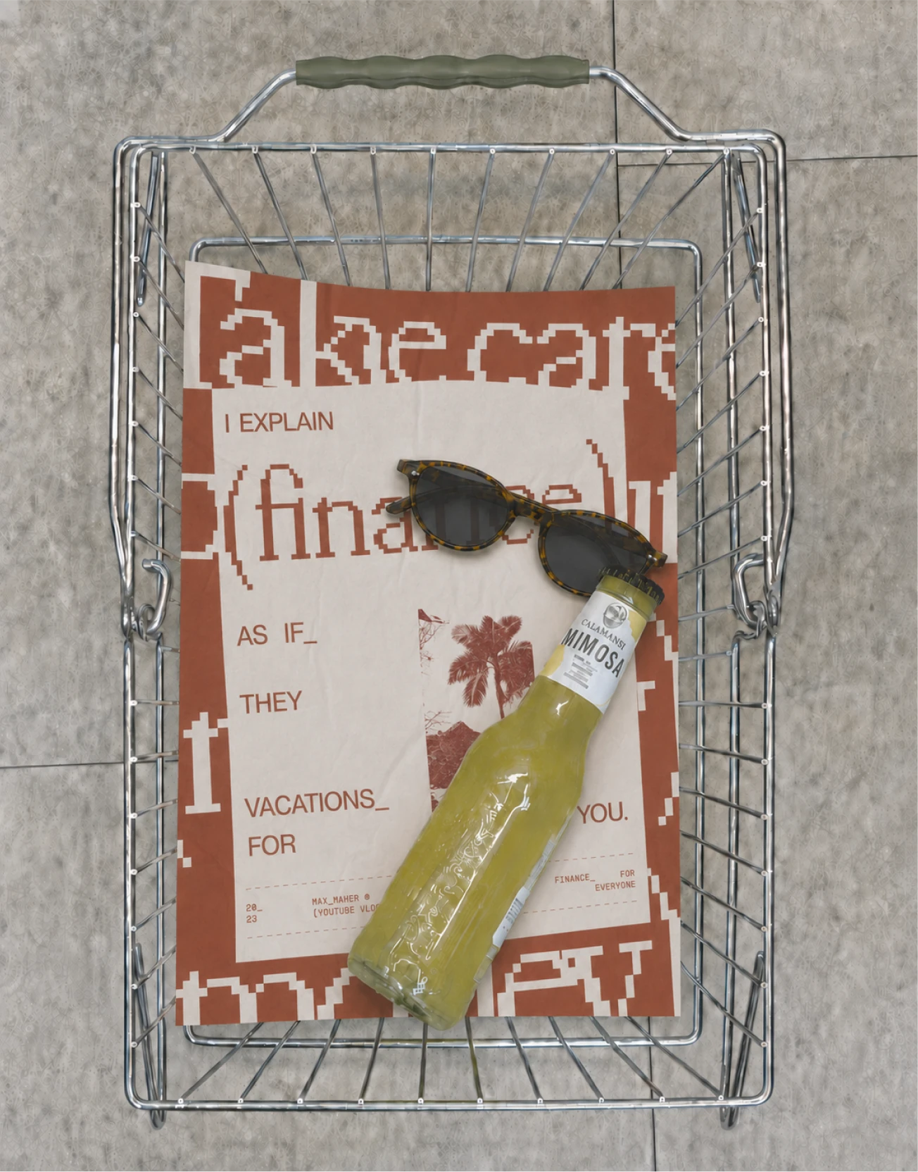
Max Maher campaign card mounted on a wire panel.
Max Maher website displayed on a phone.

(conclusion)

Completed in one month, the rebrand established a coherent identity across Max Maher’s expanding communication ecosystem. The work went beyond creating a recognizable aesthetic: it defined a visual logic for turning dense subjects into accessible content and gave his team the foundations needed to produce new material with greater speed and independence.

The result balances approachability with expertise and personality with structure. By connecting Caribbean optimism with the language of economics and technology,

the system gave Max a distinctive space within financial media—one that could evolve across formats without becoming generic or losing its point of view.

(credits)

Visual Designer / Julia Franceschini

Pss, let’s continue

See All (+)
01_Winona_UX—UI Lead, Visual & Motion Designerwinona project cover
02_Genova_Art Direction+Visual Designgenova project cover
03_Amazon_UXUI Lead+Art Direction+Visual Designamazon project cover
04_MaxMaher_Art Direction+Visual Designmaxmaher project cover05_Outliant_Art Direction+Visual Design+UXUI Leadoutliant project cover06_Lumen_Art Direction+Visual Designlumen project cover
07_Blend360_UX—UI Lead, Visual & Motion Designerblend360 project cover