(Outliant)

2024

Role

Art Director, Brand
Strategist & UX/UI
Design Lead

In a nutshell

Outliant is a fully remote digital agency that brings together strategy, design, technology, and growth. As the company evolved, a fundamental problem became increasingly visible: it had never clearly defined who it was, how it should position itself, or which part of the market it wanted to own.

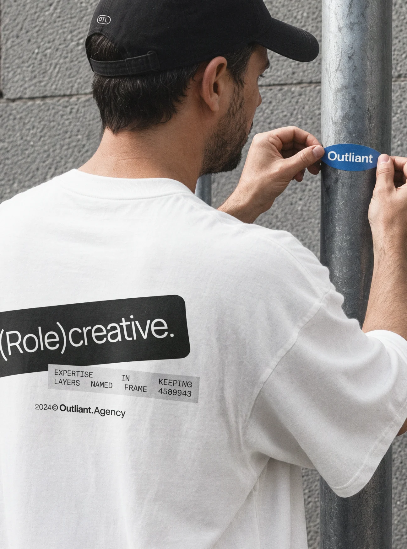
A person applying an Outliant Role Creative sticker.
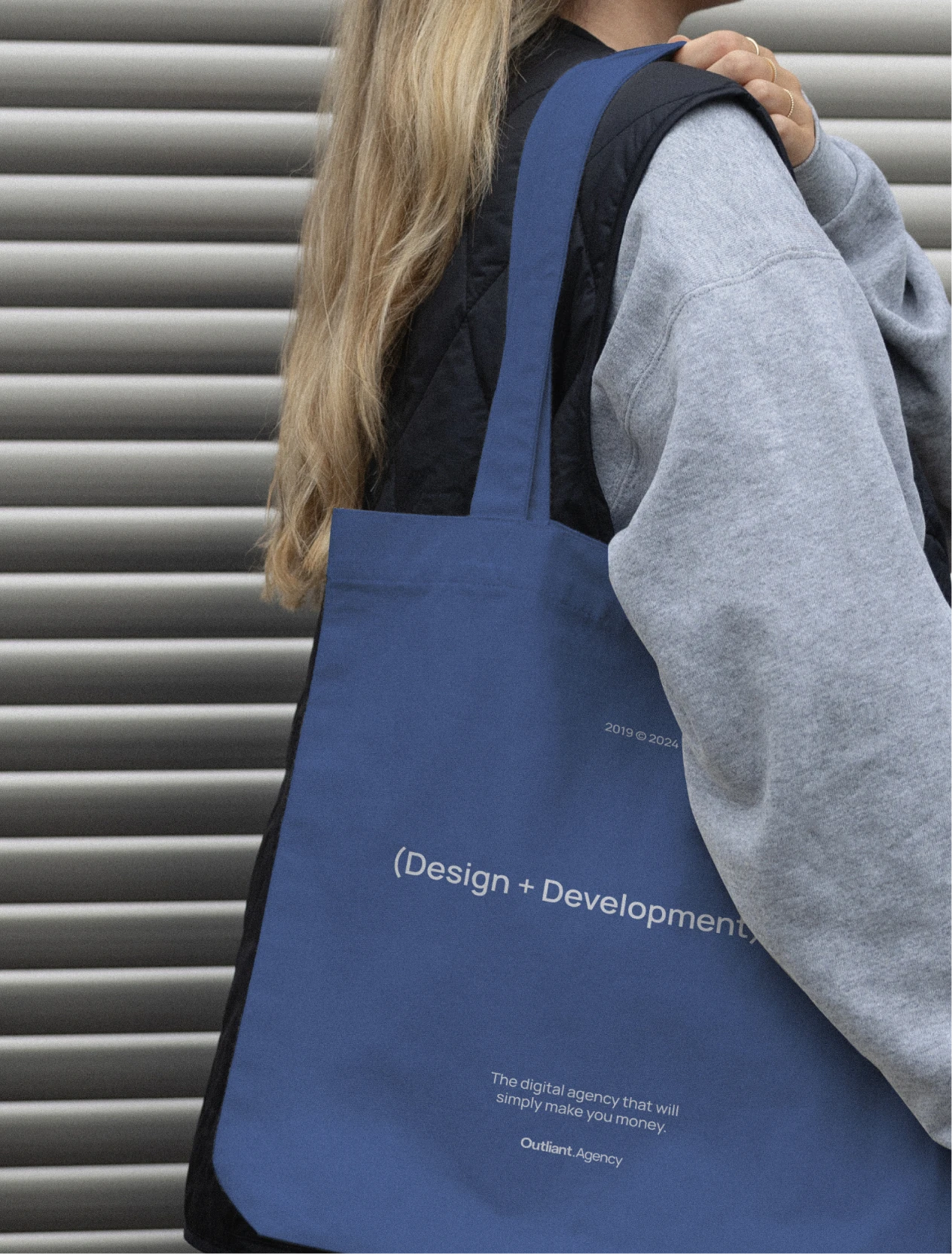
Blue Outliant tote bag.

(synopsis)

I independently developed and led Outliant’s rebrand, from research and strategic positioning to the final visual direction. The first priority was to narrow the company’s focus and establish a more coherent definition of the brand. The process examined the gap between how the company described itself, how it appeared across touchpoints, and how it wanted to be perceived. The central challenge was to move away from an undefined, all-encompassing proposition without erasing the brand’s fresh and progressive character.

Based on those findings, I reframed Outliant’s positioning around a clearer ambition: to become a trusted digital partner for mid-market and enterprise clients. This shift informed a visual system designed to feel mature, concise, and credible while preserving the energy, optimism, and technological fluency at the core of the company. Throughout the project, Skylar, Chief of Officers, and Michelle, Project Managers Lead, provided ongoing stakeholder feedback. The final direction was reviewed and approved by Outliant’s founders during the closing meetings.
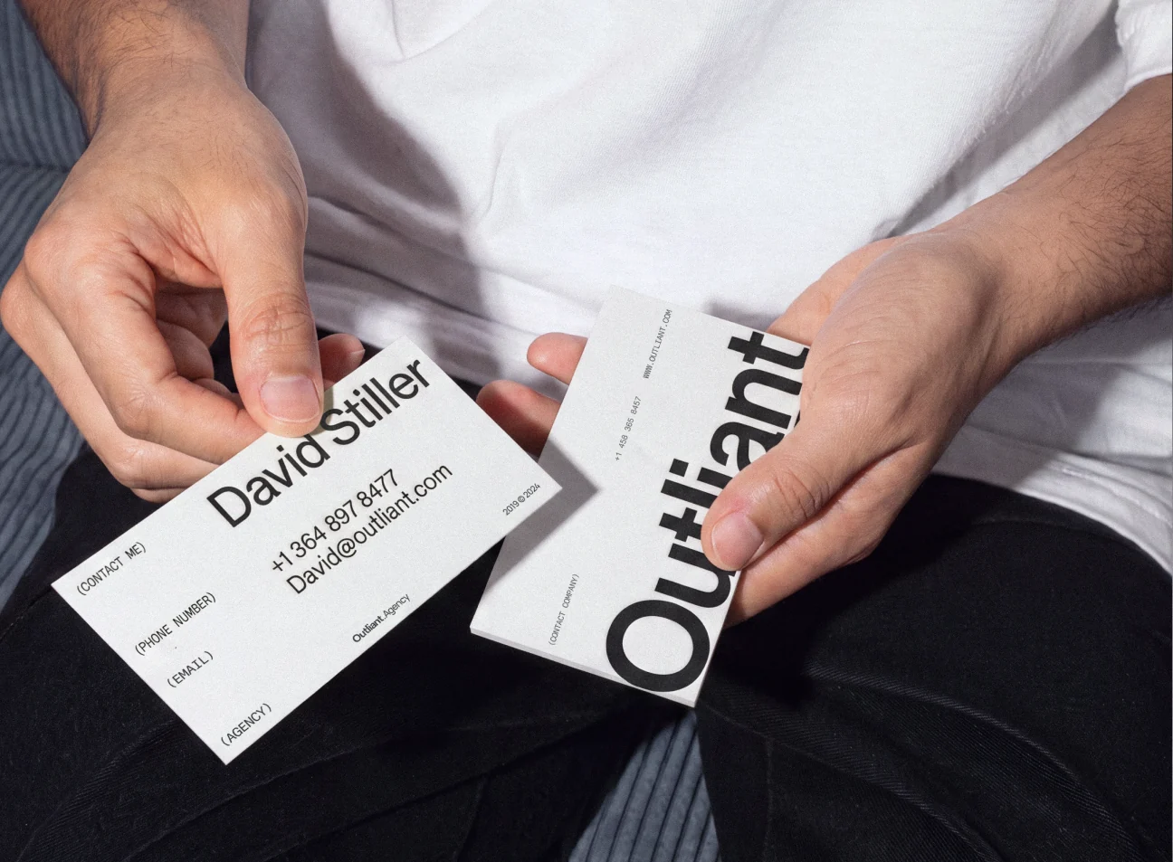
Outliant business card system.
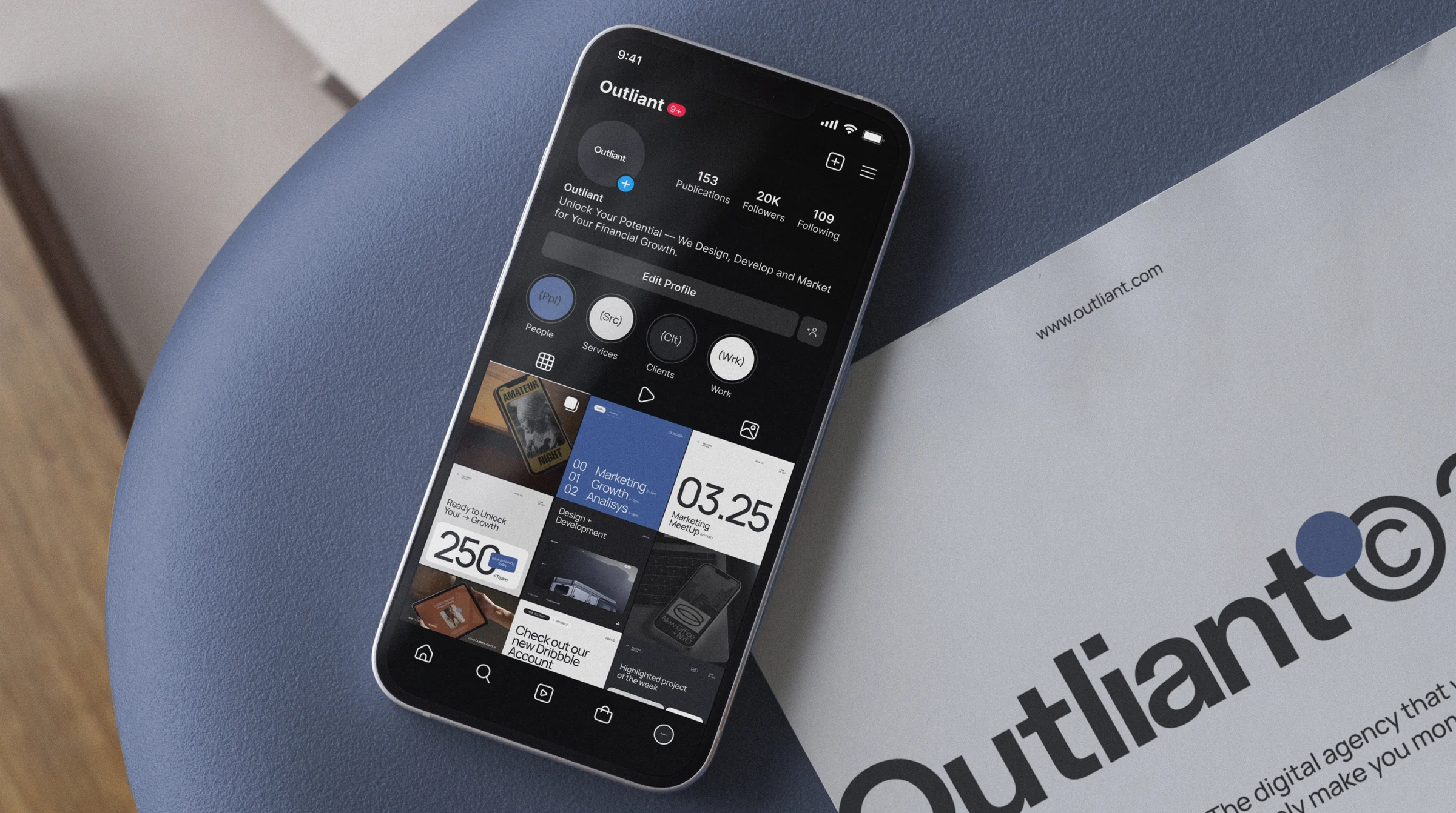
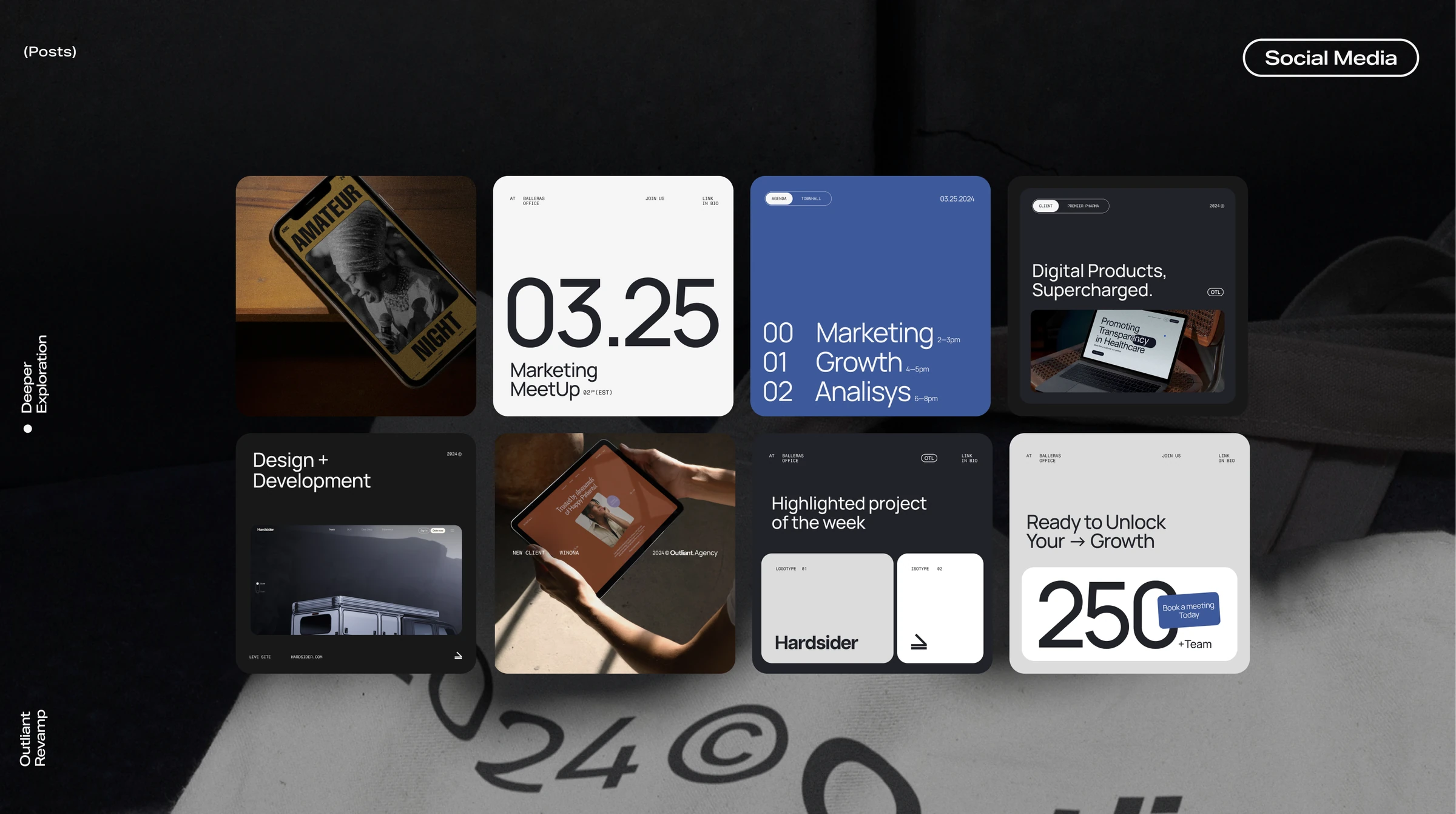
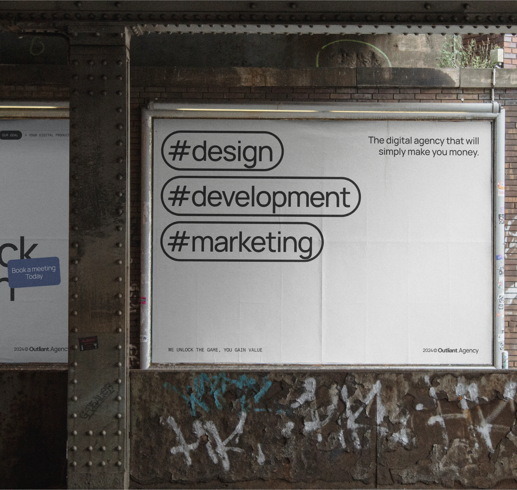
Outliant social media and brand book composition.

(constraints)

The project was developed within a tight deadline and a limited budget. The founders specifically asked that the logo and core colors should not change dramatically, as both were already established parts of Outliant’s identity. The objective was therefore evolutionary rather than disruptive: to improve the existing assets, resolve inconsistencies, and build a more refined system around recognizable brand equity.

The budget also ruled out commercial type licensing, so the typographic system was built exclusively with high-quality, freely available fonts. These constraints shaped a focused approach in which each decision needed to deliver clarity, flexibility, and immediate practical value.

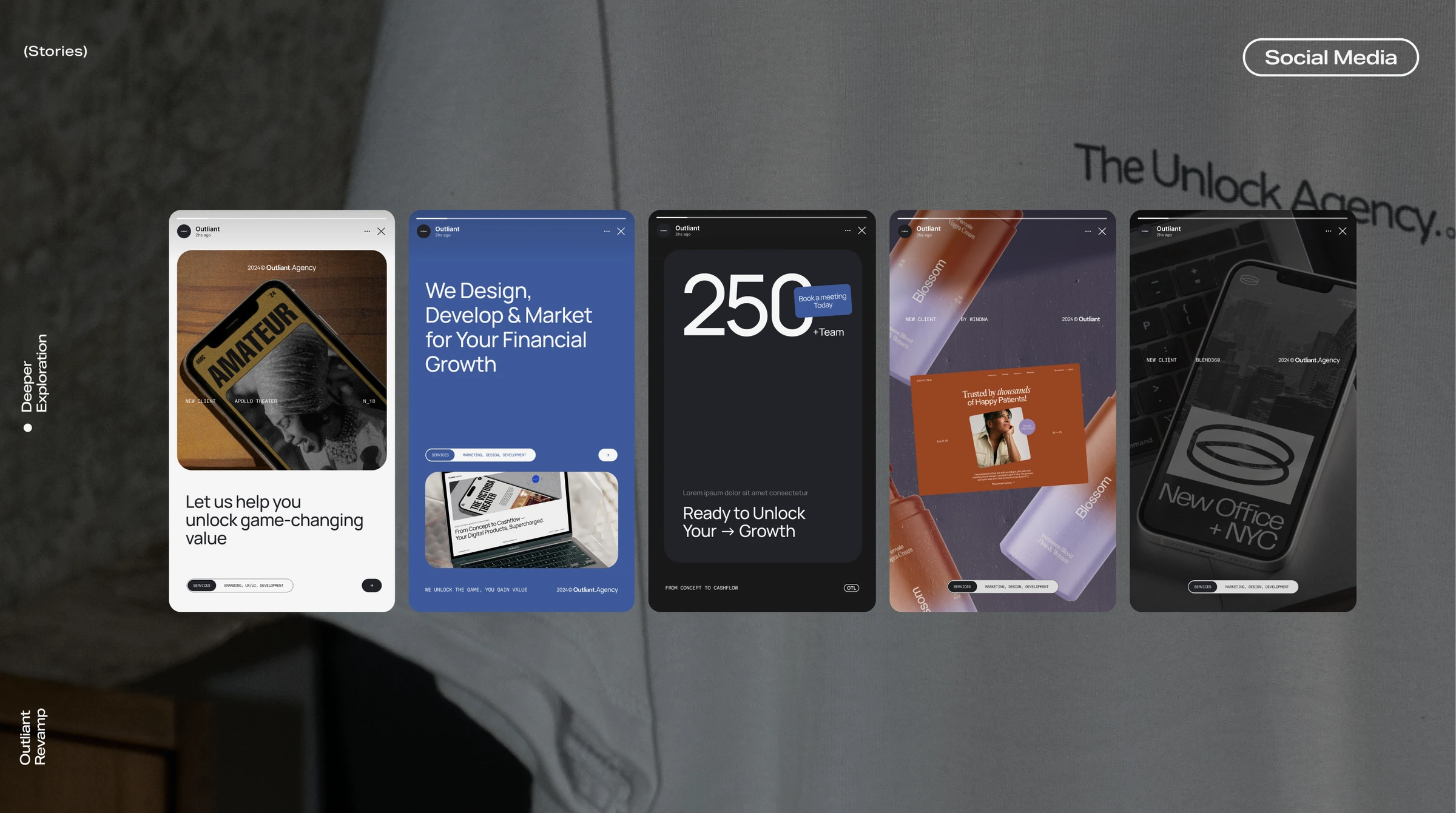
Outliant social story system.
Outliant social post system.

(visual direction)

The selected concept—The Professional & Concise Agency—uses simplicity as a sign of confidence. A restrained palette of dark grey, Outliant’s established electric blue, soft neutrals, and white creates a calmer and more intentional foundation for the work to stand out. The freely available Manrope brings clarity and subtle personality to the primary typography, while Fragment Mono introduces a precise technological accent for highlights and coded details without adding licensing costs.

Following the founders’ direction, the existing logotype was refined rather than replaced. Adjustments to spacing, proportion, and application preserved recognition while improving usability.

The standalone symbol was reduced in prominence to avoid the compositional limitations identified during the audit. Across the system, the emphasis remained on legibility, modularity, and consistency rather than change for its own sake.

(digital experience)

I translated the new positioning and visual direction into a complete website, leading the UX/UI process from structure and interface decisions through final execution. The site became the primary expression of the repositioned brand: a clearer way to explain Outliant’s offer, organize its capabilities, and communicate with a more focused enterprise audience.

Because Outliant had never worked with a formal design system, I also created its first one from the ground up. I defined reusable foundations, components, patterns, and interaction rules to make the website more consistent and give future digital work a shared, scalable language. Motion principles extended that system into transitions and behaviors, adding rhythm and technological character without compromising clarity.

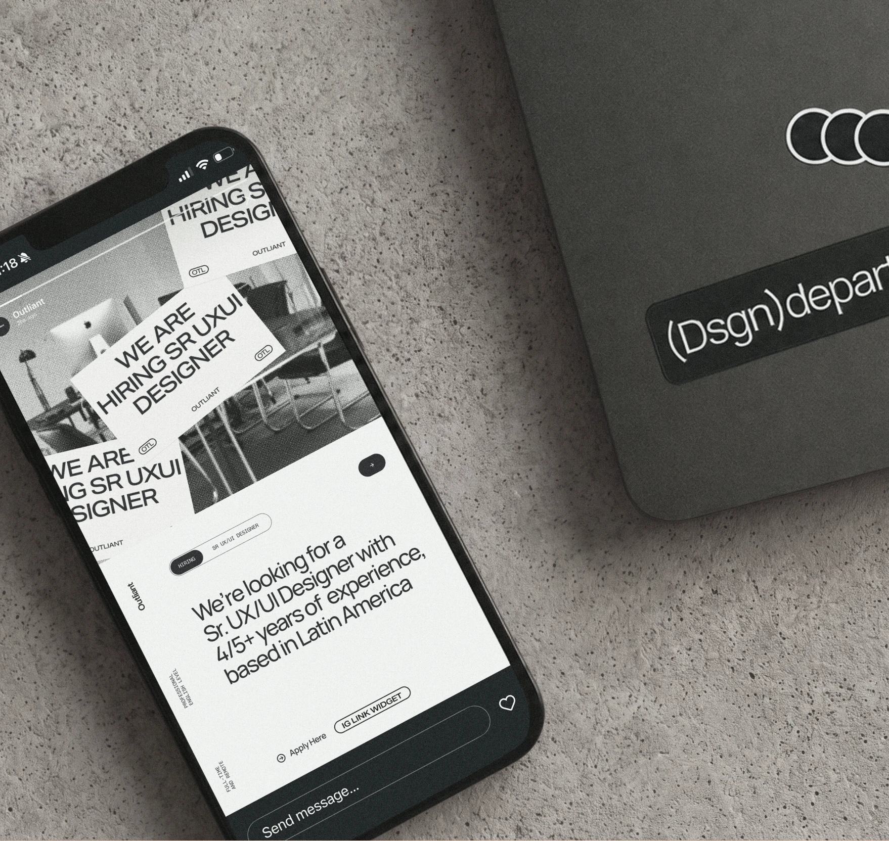
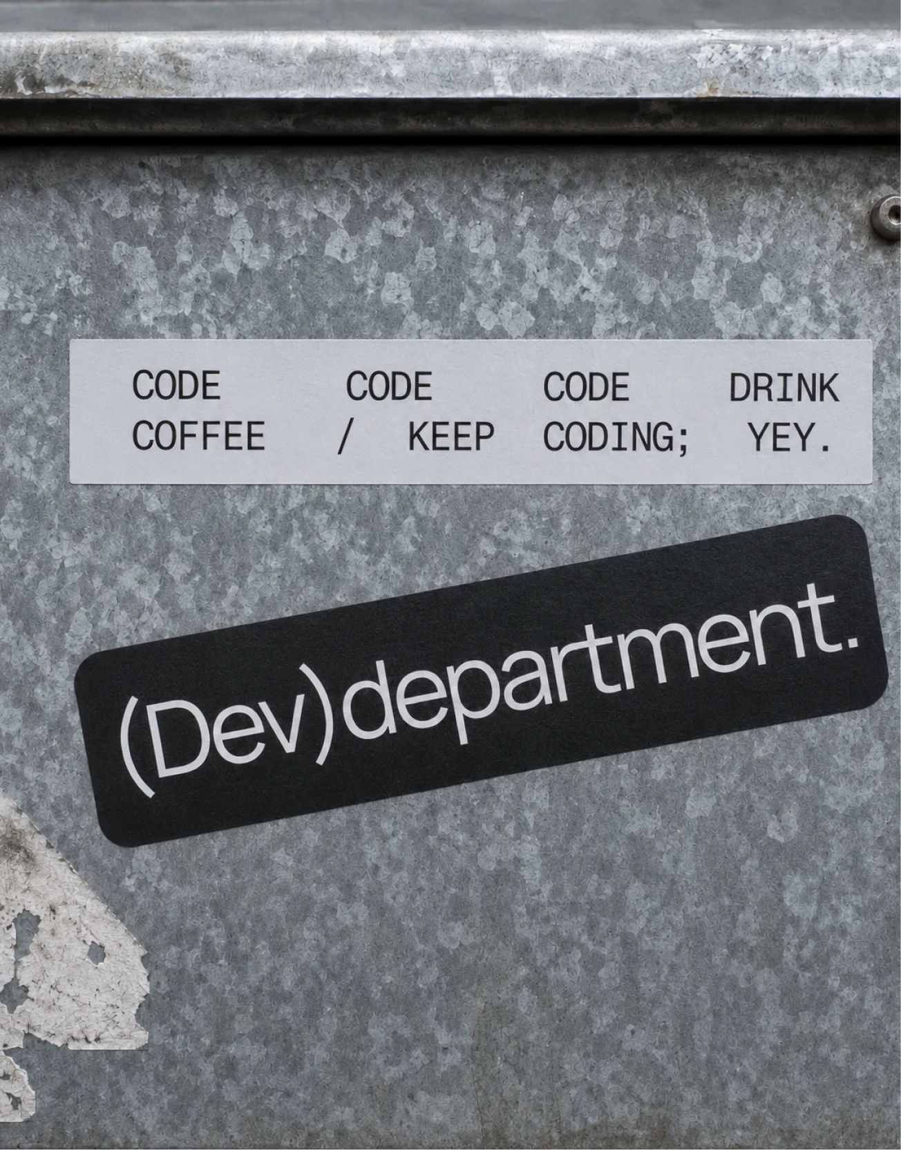
Outliant developer department stickers.

(conclusion)

The project resolved more than a visual inconsistency. It gave Outliant a clearer definition of who it was, what it stood for, and how it should position itself in the market. By closing the focus, the brand moved from trying to represent every possible service to presenting a more deliberate and credible proposition for mid-market and enterprise clients.

That strategic foundation was carried through every layer of the experience: a refined identity that preserved existing recognition, a complete website built around the new positioning, the company’s first design system, and a motion language that made the digital experience feel cohesive. Despite a tight deadline and limited budget, the project established a practical, scalable framework that Outliant could continue using across products, communications, and future growth.

(credits)

Stakeholder & CTO / Skylar Roebuck

Stakeholder & PM / Michelle Baun

Pss, let’s continue

See All (+)
01_Winona_UX—UI Lead, Visual & Motion Designerwinona project cover
02_Genova_Art Direction+Visual Designgenova project cover
03_Amazon_UXUI Lead+Art Direction+Visual Designamazon project cover
04_MaxMaher_Art Direction+Visual Designmaxmaher project cover05_Outliant_Art Direction+Visual Design+UXUI Leadoutliant project cover06_Lumen_Art Direction+Visual Designlumen project cover
07_Blend360_UX—UI Lead, Visual & Motion Designerblend360 project cover